
Art and design
Design a science fair poster
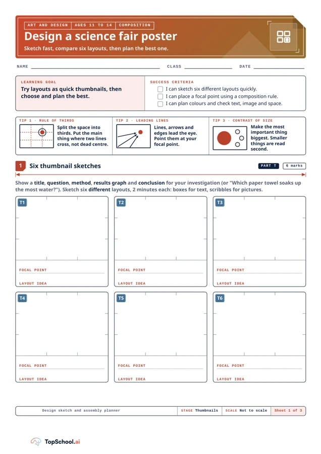
Explore six quick poster layouts, choose a focal point and develop a colour and assembly plan. The two-page A4 resource offers composition tips, a landscape grid and a checklist for text, images, hierarchy and white space.
Read the material
Explore six quick poster layouts, choose a focal point and develop a colour and assembly plan. The two-page A4 resource offers composition tips, a landscape grid and a checklist for text, images, hierarchy and white space.
Complete resource. Use the preview for diagrams and layout.
Page 1
NAME
CLASS
DATE
LEARNING GOAL
Try layouts as quick thumbnails, then
choose and plan the best.
SUCCESS CRITERIA
I can sketch six different layouts quickly.
I can place a focal point using a composition rule.
I can plan colours and check text, image and space.
TIP 1 · RULE OF THIRDS
Split the space into
thirds. Put the main
thing where two lines
cross, not dead centre.
TIP 2 · LEADING LINES
Lines, arrows and
edges lead the eye.
Point them at your
focal point.
TIP 3 · CONTRAST OF SIZE
Make the most
important thing
biggest. Smaller
things are read
second.
Show a title, question, method, results graph and conclusion for your investigation (or "Which paper towel soaks up
the most water?"). Sketch six different layouts, 2 minutes each: boxes for text, scribbles for pictures.
FOCAL POINT
LAYOUT IDEA
FOCAL POINT
LAYOUT IDEA
FOCAL POINT
LAYOUT IDEA
FOCAL POINT
LAYOUT IDEA
FOCAL POINT
LAYOUT IDEA
FOCAL POINT
LAYOUT IDEA
Design sketch and assembly planner
STAGE Thumbnails
SCALE Not to scale
Sheet 1 of 3
ART AND DESIGN
AGES 11 TO 14
COMPOSITION
Design a science fair poster
Sketch fast, compare six layouts, then plan the best one.
Six thumbnail sketches
PART T
6 marks
1
T1
T2
T3
T4
T5
T6
Page 2
Redraw your best thumbnail full size. Draw leader lines to letters B, C and D, then explain each.
I CHOSE THUMBNAIL
T
WHAT WILL VISITORS SEE FIRST?
A
EXAMPLE
Title in the top third,
biggest text.
B
C
D
Colour each box, then name the colour in words and say where you will use it.
MAIN COLOUR
COLOUR
IN
NAME
USE
BACKGROUND
COLOUR
IN
NAME
USE
ACCENT
COLOUR
IN
NAME
USE
TEXT
COLOUR
IN
NAME
USE
T
TEXT
Short headings, few
words
Dark text on light, or
light on dark
I
IMAGE
Graph has labelled axes
Each picture has a
caption
H
HIERARCHY
Title biggest, then
headings
Eye goes to the focal
point first
W
WHITE SPACE
Clear margin round the
edge
Gaps between blocks
Design sketch and assembly planner
DRAWN BY
REV
Sheet 2 of 3
ART AND DESIGN
AGES 11 TO 14
DEVELOPED DESIGN
Develop your strongest layout
Choose and develop your design
PART D
6 marks
2
POSTER AREA: LANDSCAPE (5 MM GRID)
Colour palette planner
4 marks
3
Assembly checklist
Tick when done
4
A
A teaching sequence
Generate and evaluate layout thumbnails, select a focal point and plan a readable, balanced science-fair poster.
Sketch six possible layouts
Make six quick thumbnail sketches and mark each focal point; do not add full paragraphs or detailed images yet.
Where is the focal point in each quick thumbnail?
Develop the reading order
Develop the strongest layout on the landscape grid and use leader lines to explain selected design choices.
What will a visitor see first, and what might they miss?
Plan readable colours
Plan colours for the main area, background, accent and text, noting where each will be used.
Which text and background pair gives clear contrast?
Check the investigation poster
Check the poster against the assembly list: short text, readable contrast, labelled graph, captioned images, hierarchy and white space. Trace the hierarchy on the sketch.
Are the graph axes labelled and each image captioned?
Before you teach
Look for the thinking behind an answer, choose the support your class needs and leave room for an independent response.
What to look for
Look for several distinct layouts, a clear focal point and a final plan that allows text, images and data to be read. Ask: “Where will a viewer look first, and what information might they miss?” The worksheet plans a poster but does not verify the science content.
Give a little support
Provide a simple grid and two example layouts to compare. Let pupils annotate with labels instead of full sketches and offer a limited colour palette to make the planning task manageable.
Take the idea further
Develop the strongest layout on the landscape grid and use leader lines to explain design choices.
Things to keep in mind
Pupils still need accurate investigation information and a graph for the final design.
Keep the idea. Make it yours.
Bring your topic, learning goal and class context to PLAI™, then review what you create.
Ideas to try with your class
Sample teaching perspectives on what to try, what to adapt and what to watch for.
Meet The Creators
Meet a creator whose teaching interests connect with this template.

Margin Note
The science-poster task asks for six quick thumbnails, then a full-size redraw of the best layout with a focal point, colour choices and checks for text, image and space. The prompt names the question, method, results graph and conclusion.
Five More Minutes
Rule of thirds, leading lines and contrast of size are presented as layout tools to test, not as automatic recipes. Comparing six sketches before choosing one makes the composition decision visible before assembly.
Notes Between Bells
The two-minute thumbnail limit keeps the first stage exploratory, with boxes for text and scribbles for images. A pupil can state what visitors should see first before using leader lines to explain the selected design.
Tea Break Notes
A balanced poster cannot compensate for unclear or inaccurate science. The investigation content must be verified separately, and the chosen graph and conclusion should fit the actual results before the design is assembled.